设为首页
收藏本站
开启辅助访问
切换到宽版
登录
立即注册
快捷导航
发布信息
搜索
搜索
网站首页
自丢网
社区论坛
自丢网论坛
附件中心
源码下载
邀请码
丢币充值
帖子
搜索附件
搜索附件
自丢网
›
附件中心
›
建站程序/IT教程
›
建站/web前端教程
›
1.gif
板块导航
+
模板下载
+
建站程序/IT教程
·
源码下载
·
修罗xiuno教程
·
Discuz教程
·
zzz资源/教程
·
织梦教程
·
服务器教程
·
数据库教程
·
Html/Html5教程
·
JavaScript教程
·
Css/Css3教程
·
建站/web前端教程
·
PHP教程
·
其他编程教程
·
小程序app教程
·
PPT模板/素材
·
Word简历模板/素材
·
Excel模板/素材
·
素材中心
·
百科知识
+
综合教程资源
热门下载
·
phpmyadmin报错问题排查.jpg
·
phpmyadmin管理软件.jpg
·
ping规则.png
·
d盾扫木马攻击最新绿色免安装版本.jpg
·
本站已经运行.jpg
·
d_safe_2.1.8.1.zip
·
demo.zip
左侧广告
版权所有:自丢网
For 2020-2050 ©
zidiu.com
1.gif
打开方式: 图片查看器
资料大小: 192.41 KB
下载次数: 71
上传会员:
admin
上传时间: 2022-09-19
本站网址:
www.zidiu.com
查看附件所在的主题
下载附件
复制链接推荐给好友
点击附件下载:下载附件
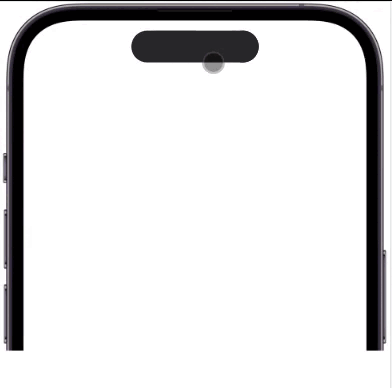
HTML5CSS3+JS实现灵动岛效果:
主要利用CSS3-animation + JS实现效果,只是提供思路,具体细节可以参考
代码如下:
<!DOCTYPE html>
<html lang="en">
<head>
<meta charset="UTF-8" />
<meta http-equiv="X-UA-Compatible" content="IE=edge" />
<title>灵动岛</title>
<style>
* {
margin: 0;
padding: 0;
}
#iphone14pro {
position: relative;
margin: auto;
width: 974px;
height: 876px;
overflow: hidden;
background-image: url([img]https://www.qcodes.cn/wp-content/uploads/2022/09/2022091405393859.png[/img]);
}
.demo {
width: 320px;
margin-top: 72px;
margin: 72px auto 0;
background-color: red;
height: 80px;
border-radius: 40px;
background-color: #272729;
position: relative;
}
.demo::after {
position: absolute;
content: " ";
right: 0;
width: 80px;
height: 100%;
border-radius: 80px;
background-color: #272729;
}
/* 变长 */
.longer {
animation: longer 800ms ease-in-out forwards;
}
@keyframes longer {
0% {
}
60% {
width: 50vw;
}
80% {
transform: scaleX(1.04);
}
100% {
transform: scaleX(1);
width: 50vw;
}
}
/* 分离 */
.divide {
animation: divide-left 800ms ease-in-out forwards;
}
@keyframes divide-left {
0% {
}
40% {
transform: scaleX(1.1);
}
100% {
transform: scaleX(1);
}
}
.divide::after {
animation: divide-right 800ms ease-in-out forwards;
}
@keyframes divide-right {
0% {
}
40% {
transform: scaleX(1.1);
}
100% {
transform: scaleX(1);
right: -100px;
}
}
/* 融合 */
.fusion {
animation: fusion-left 800ms ease-in-out forwards;
}
@keyframes fusion-left {
0% {
}
40% {
transform: scaleX(1.1);
}
100% {
transform: scaleX(1);
}
}
.fusion::after {
animation: fusion-right 800ms ease-in-out forwards;
}
@keyframes fusion-right {
0% {
right: -100px;
}
40% {
transform: scaleX(1.1);
}
100% {
transform: scaleX(1);
right: 0;
}
}
/* 变大 */
.bigger {
animation: bigger 800ms ease-in-out forwards;
}
@keyframes bigger {
0% {
}
60% {
width: 81vw;
height: 400px;
border-radius: 100px;
}
80% {
transform: scaleX(1.04);
}
100% {
width: 81vw;
height: 400px;
border-radius: 100px;
transform: scaleX(1);
}
}
.bigger::after {
display: none;
}
</style>
</head>
<body>
<div id="iphone14pro">
<div class="demo"></div>
</div>
<script>
// 灵动岛对应dom
const box = document.querySelector(".demo");
const animationList = ["longer", "divide", "fusion", "bigger"];
box.addEventListener("click", () => {
box.classList.add(animationList[index]);
});
let index = 0;
// 每一个动画结束都会触发此事件(包括子元素及不同种类属性动画)
box.addEventListener("animationend", (e) => {
if (
e.animationName === "divide-right" ||
e.animationName === "fusion-right"
) {
return;
}
index++;
setTimeout(() => {
if (index <= animationList.length - 1) {
box.classList.add(animationList[index]);
} else {
index = 0;
}
}, 800);
});
</script>
</body>
</html>
复制代码

 1.gif
1.gif